If there is one prayer that you should pray/sing every day and every hour, it is the
LORD's prayer (Our FATHER in Heaven prayer)
It is the most powerful prayer.
A pure heart, a clean mind, and a clear conscience is necessary for it.
- Samuel Dominic Chukwuemeka
For in GOD we live, and move, and have our being. - Acts 17:28
The Joy of a Teacher is the Success of his Students. - Samuel Dominic Chukwuemeka
Solved Examples on Introductory Statistics, Data Collection, Data Organization, and Data Presentation
For ACT Students
The ACT is a timed exam...60 questions for 60 minutes
This implies that you have to solve each question in one minute.
Some questions will typically take less than a minute a solve.
Some questions will typically take more than a minute to solve.
The goal is to maximize your time. You use the time saved on those questions you
solved in less than a minute, to solve the questions that will take more than a minute.
So, you should try to solve each question correctly and timely.
So, it is not just solving a question correctly, but solving it correctly on time.
Please ensure you attempt all ACT questions.
There is no negative penalty for any wrong answer.
For JAMB and CMAT Students
Calculators are not allowed. So, the questions are solved in a way that does not require a calculator.
Attempt all questions.
Show all work.
(1.) The table below shows the voltage measurements from a home in the City of Truth or Consequences, New Mexico for 25 days.
Day
Voltage (volts)
$1$
$121.3$
$2$
$121.1$
$3$
$121.5$
$4$
$121.7$
$5$
$122.0$
$6$
$121.2$
$7$
$121.2$
$8$
$121.3$
$9$
$121.2$
$10$
$121.7$
$11$
$121.6$
$12$
$121.9$
$13$
$121.5$
$14$
$121.4$
$15$
$121.8$
$16$
$121.8$
$17$
$121.2$
$18$
$121.4$
$19$
$121.1$
$20$
$121.9$
$21$
$121.7$
$22$
$121.9$
$23$
$121.9$
$24$
$121.3$
$25$
$121.6$
(a.) Draw a frequency distribution table for the data. Your table should have 5 classes.
(b.) Compute the statistical properties of the classes.
Maximum voltage value = $122.0$
Minimum voltage value = $121.1$
Range = $122.0 - 121.1 = 0.9$
Number of classes = $5$
Class Width = $\dfrac{0.9}{5} = 0.18 \approx 0.2$
Based on the note, Data Organization;
If the class intervals (the $LCI$ and the $UCI$) are decimals rounded to one decimal place,
then the difference between the lower class interval of a class and the upper class interval of the previous class is $0.1$
$
LCI\:\:of\:\:2nd\:\:Class - UCI\:\:of\:\:1st\:\:Class = 0.1 \\[3ex]
1st\:\:Class = 121.1 - 121.2 \\[3ex]
2nd\:\:Class = 121.3 - 121.4 \\[3ex]
UCB\:\:of\:\:1st\:\:Class = \dfrac{UCI\:\:of\:\:1st\:\:Class + LCI\:\:of\:\:2nd\:\:Class}{2} = \dfrac{121.2 + 121.3}{2} = \dfrac{242.5}{2} = 121.25 \\[5ex]
LCB\:\:of\:\:1st\:\:Class = \dfrac{LCI\:\:of\:\:1st\:\:Class + UCI\:\:of\:\:previous\:\:Class}{2} \\[5ex]
$
We do not have a previous class.
But, assuming we did; the $UCI$ of that class would be $121.2 - 0.2 = 121.0$
$
\therefore LCB\:\:of\:\:1st\:\:Class = \dfrac{121.1 + 121.0}{2} = \dfrac{242.1}{2} = 121.05 \\[5ex]
Class\:\:Boundary\:\:of\:\:1st\:\:Class = 121.05 - 121.25 \\[3ex]
$
The Frequency Distribution Table is constructed as shown:
Voltage Intervals
Tally
Frequency, $F$
Class Midpoints
Class Boundaries
Relative Frequency, $RF$
Cumulative Frequency, $CF$
$121.1 - 121.2$
IIII I
$6$
$\dfrac{121.1 + 121.2}{2} = 121.15$
$121.05 - 121.25$
$\dfrac{6}{25} = 0.24 = 24\%$
$6$
$121.3 - 121.4$
IIII
$5$
$\dfrac{121.3 + 121.4}{2} = 121.35$
$121.25 - 121.45$
$\dfrac{5}{25} = \dfrac{1}{5} = 0.2 = 20\%$
$6 + 5 = 11$
$121.5 - 121.6$
IIII
$4$
$\dfrac{121.5 + 121.6}{2} = 121.55$
$121.45 - 121.65$
$\dfrac{4}{25} = 0.16 = 16\%$
$11 + 4 = 15$
$121.7 - 121.8$
IIII
$5$
$\dfrac{121.7 + 121.8}{2} = 121.75$
$121.65 - 121.85$
$\dfrac{5}{25} = \dfrac{1}{5} = 0.2 = 20\%$
$15 + 5 = 20$
$121.9 - 122.0$
IIII
$5$
$\dfrac{121.9 + 122.0}{2} = 121.95$
$121.85 - 122.05$
$\dfrac{5}{25} = \dfrac{1}{5} = 0.2 = 20\%$
$20 + 5 = 25$
$\Sigma F = 25$
$\Sigma RF = 1 = 100\%$
(2.) The ages of the 2016 United States presidential candidates from 4 political parties are:
$70$
$64$
$45$
$45$
$65$
$63$
$66$
$54$
$62$
$58$
$53$
$61$
$71$
$61$
$45$
$48$
$66$
$53$
$63$
$70$
$55$
$68$
$75$
$65$
$63$
Use 5 classes to form a grouped data.
(3.) 120 Nursing majors took a standardized test.
The scores are summarized in the Frequency Table as shown:
Scores
Frequency
Scores
Cumulative Frequency
$160 - 179$
$17$
$Less\:\:than\:\:180$
$17$
$180 - 199$
$20$
$Less\:\:than\:\:200$
$37$
$200 - 219$
$19$
$Less\:\:than\:\:220$
$56$
$220 - 239$
$x$
$Less\:\:than\:\:240$
$70$
$240 - 259$
$17$
$Less\:\:than\:\:260$
$87$
$260 - 279$
$33$
$Less\:\:than\:\:280$
$y$
Calculate the values of x and y
$
56 + x = 70 \\[3ex]
x = 70 - 56 \\[3ex]
x = 14 \\[3ex]
87 + 33 = y \\[3ex]
120 = y \\[3ex]
y = 120
$
(4.) CSEC The cumulative frequency distribution of the volume of petrol needed to fill the tanks
of 150 different vehicles is shown below.
Volume (litres)
Cumulative Frequency
$11 - 20$
$24$
$21 - 30$
$59$
$31 - 40$
$101$
$41 - 50$
$129$
$51 - 60$
$150$
(a.) For the class 21 – 30, determine the
(i) lower class boundary
(ii) class width
(b.) How many vehicles were recorded in the class 31 – 40?
(c.) A vehicle is chosen at random from the 150 vehicles.
What is the probability that the volume of petrol needed to fill its tank is more than 50.5 litres? Leave your answer as a fraction.
(d.) Byron estimates the median amount of petrol to be 43.5 liters.
Explain why Byron's estimate is INCORRECT.
(e.) On the partially labelled grid below, construct a histogram to represent the distribution of the volume of petrol
needed to fill the tanks of the 150 vehicles.
(a.) For the class $21 - 30$,
$
(i)\:\: LCB = \dfrac{21 + 20}{2} = \dfrac{41}{2} = 20.5 \\[5ex]
(ii)\:\: CW = 21 - 11 = 10 \\[3ex]
$
Let us re-draw the table to show the frequencies
Volume (litres)
Frequency
Cumulative Frequency, $CF$
$11 - 20$
$24$
$24$
$21 - 30$
$59 - 24 = 35$
$59$
$31 - 40$
$101 - 59 = 42$
$101$
$41 - 50$
$129 - 101 = 28$
$129$
$51 - 60$
$150 - 129 = 21$
$150$
(b.) The number of vehicles recorded in the 31 – 40 class is the frequency of that class.
Therefore, 42 vehicles were recorded in the class 31 – 40
The number of vehicles whose tank is more than $50.5$ litres is the frequency of the $51 - 60$ class
Let $E$ be the event of selecting a vehicle whose tank is more than $50.5$ litres
Let $S$ be the sample space - the total number of vehicles.
$
n(E) = 21 \\[3ex]
n(S) = 150 \\[3ex]
P(E) = \dfrac{n(E)}{n(S)} \\[5ex]
P(E) = \dfrac{21}{150} \\[5ex]
P(E) = \dfrac{7}{50} \\[5ex]
$
(d.) Prerequisite to answer (c.) is: Measures of Center
$
\Sigma f = 150 \\[3ex]
\dfrac{\Sigma f}{2} = \dfrac{150}{2} = 75 \\[5ex]
Begin\:\:from\:\:the\:\:first\:\:class \\[3ex]
Keep\:\:adding\:\:the\:\:frequencies\:\:till\:\:you\:\:get\:\:to\:\:10 \\[3ex]
24 + 35 = 59 \\[3ex]
59 + 42 = 101...stop \\[3ex]
Or\:\:better still \\[3ex]
CF\:\:of\:\:3rd\:\:class = 101...stop \\[3ex]
$
Therefore, the class that contains the median is the $3rd$ class = $31 - 40$
Byron's estimate of $43.5$ is in the $4th$ class = $41 - 50$. That is incorrect.
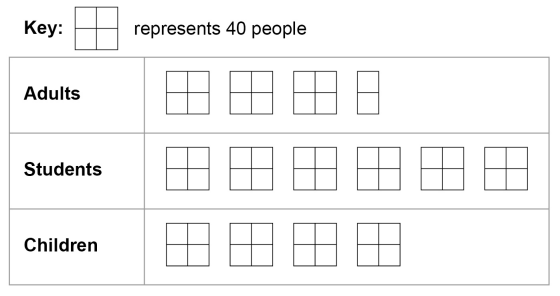
(5.) GCSE Here is some information, by ticket type, about the number of people visiting a cinema one week.
(a) How many children visited the cinema?
(b) How many more students than adults visited the cinema?
(c) A bar chart is drawn to show the number of people visiting the cinema one month.
Give one criticism of the bar chart.
$
Key:\;\;1\;box = 40\;people \\[3ex]
(a) \\[3ex]
Number\;\;of\;\;children \\[3ex]
= 4\;boxes \\[3ex]
= 4(40) \\[3ex]
= 160\;people \\[3ex]
(b) \\[3ex]
Number\;\;of\;\;students \\[3ex]
= 6\;boxes \\[3ex]
= 6(40) \\[3ex]
= 240\;people \\[3ex]
Number\;\;of\;\;adults \\[3ex]
= 3\dfrac{1}{2}\;boxes \\[5ex]
= \dfrac{7}{2}(40) \\[5ex]
= 7(20) \\[3ex]
= 140\;people \\[3ex]
More\;\;students\;\;than\;\;adults \\[3ex]
= students - adults \\[3ex]
= 240 - 140 \\[3ex]
= 100\;people \\[3ex]
$
(c)
The scale on the vertical axis (Number of people) is incorrect because 2500 is missing.
This implies that the number of Students is not represented correctly on the bar chart.
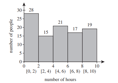
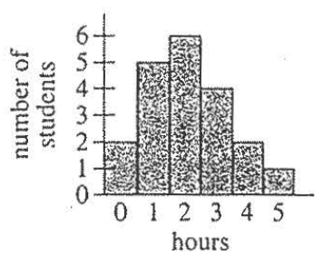
(6.) ACT The histogram below shows the results of a survey of 100 people.
Each person identified the number of hours per week that they watch TV.
How many people surveyed watch TV at least 4 hours per week?
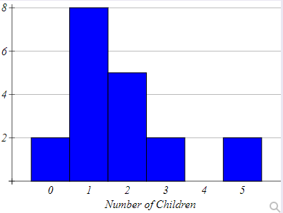
(7.) A group of adults were asked how many children they have in their families.
The histogram below shows the number of adults who indicated each number of children.
(a.) How many adults were questioned?
(b.) What percentage of the adults questioned had a child?
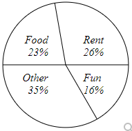
(8.) Judith categorized her spending for this month into four categories: Rent, Food, Fun, and Other.
The percents she spent in each category are shown below.
If Judith spent a total of $2500 this month, how much did she spend on Fun?
(9.) ACT A survey in a study skills class asked the 20 students enrolled in the class how many hours
(rounded to the nearest hour) they has spent studying on the previous evening.
The 20 responses are summarized by the histogram below.
The teacher decides to show the data in a circle graph (pie chart).
What should be the measure of the central angle of the sector for 3 hours?
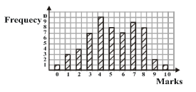
The bar chart above shows the distribution of marks scored by 60 pupils in a test in which the
maximum score was 10.
If the pass mark was 5, what percentage of the pupils failed the test?
From the Bar Graph,
$1$ student earned $0$
$3$ students earned $1$
$4$ students earned $2$
$7$ student earned $3$
$10$ students earned $4$
$8$ students earned $5$
$7$ student earned $6$
$9$ students earned $7$
$8$ students earned $8$
$2$ students earned $9$
$1$ students earned $10$
(11.) An American study published in a recent year claimed to find evidence of voting by noncitizens.
The conclusion was based largely on a survey several years prior in which approximately 38,000
registered voters were asked both whether they voted and whether they were citizens.
A total of 339 of those surveyed reported being noncitizens, and a total of 48 of these people
also said they voted.
(a.) Based on the survey, what percentage of noncitizens claim to have voted?
(Round to the nearest whole number as needed.)
(b.) One difficulty with any survey is response error, in which, for example, people accidentally
check the wrong box.
Suppose that the response error rate for this survey was only 0.1%, meaning that 99.9% of those
surveyed answered the survey questions accurately.
How many people would have answered the citizenship question incorrectly?
(Round to the nearest whole number as needed.)
(c.) Assume that the result from part(b.) represents citizens who accidentally said they were
noncitizens when they were citizens, and that all these people voted.
If all other results from this survey were accurate, how would this one set of errors change the
number of noncitizens who voted?
(Type an integer)
(d.) How large a response error could have accounted for all the noncitizens voting found in the
survey?
(Round to two decimal places as needed.)
(e.) The original survey was repeated two years later, with some (but not all) of the same people
asked the same questions about citizenship and voting status that year.
There were indeed changes in responses to the citizenship question among those who participated
in the survey both times, suggesting response errors.
In addition, a total of 85 people claimed to be noncitizens in both surveys, and among these zero
reported having voted.
How does this result support the claims of those people who say the study was flawed and that, in
fact, it offered no evidence of noncitizen voting?
$
number\;\;surveyed = 38000 \\[3ex]
number\;\;who\;\;answered\;\;citizenship\;\;question\;\;incorrectly \\[3ex]
= 0.1\%\;\;of\;\;38000 \\[3ex]
= \dfrac{0.1}{100} * 38000 \\[5ex]
= 38 \\[3ex]
$
(c.)
48 people of those who reported being noncitizens, said they voted.
Based on a survey response error rate of 0.1%, 38 people would have said they were noncitizens.
This set of errors would mean that the number of noncitizens who voted = 48 − 38 = 10 noncitizens.
(d.)
38000 were surveyed
48 claimed to be noncitizens who voted
To account for all those who claimed to be noncitizen voters, the error rate would be:
what percent of 38000 is 48?
$
\dfrac{is}{of} = \dfrac{what\%}{100}...Percent-Proportion \\[5ex]
\dfrac{48}{38000} = \dfrac{what\%}{100} \\[5ex]
38000 * what\% = 48 * 100 \\[3ex]
what\% = \dfrac{48 * 100}{38000} \\[5ex]
what\% = 0.126315189 \\[3ex]
what\% \approx 0.13\% \\[3ex]
$
(e.)
The fact that there were zero voters among the 85 people who gave consistent answers about being
noncitizens suggests that no noncitizens voted.
(12.) Swayed by concerns for family and desires to be environmentally conscious, a movement has been building across the nation to use green household cleaning products.
Consumers have been voting with their wallets in support of green products.
Unfortunately, some products advertise as being green when in reality they are not.
A label touting "natural" can be misleading.
Nancy Guberti, a nutritionist and healthy lifestyle coach shares that "Natural means nothing.
The consumer has to be educated. It's all about awareness" (2013).
In addition, the internet is awash with homemade recipes promoted as safe for your family and the environment.
Making household cleaners from natural ingredients may give some a false sense of security and can place pets at risk. Some may not realize how significant the danger can be to pets with some threats being potentially even deadly.
A label touted as green can be misleading as risk to people and pets may still be present.
(Source: Associated Press. "Keep out of reach of pets: green cleaners not necessarily safe for pets." The Christian Science Monitor. 5, Mar 2013. Retrieved from http://www.csmonitor.com/The-Culture/Family/2013/0305/Keep-out-of-reach-of-pets-Green-cleaners-not-necessarily-safe-for-pets)
Which of the following should consumers do to be educated on the use of green products around family pets? A. Read labels. B. Research the ingredients. C. Talk to their veterinarians. D. All of the above.
All of the above.
(13.) Assume Blue Ridge Community College (BRCC) conducts an annual survey of American fears.
One of the objects of this survey is to collect annual data on the fears, worries, and concerns of Americans.
In 2017, the survey sampled 1207 participants.
One of the survey findings was that 16% believe that Bigfoot is a real creature.
(a.) Identify the sample.
(b.) Identify the population.
(c.) Is the value 16% a parameter or a statistic?
(d.) What symbol would be used for this value?
(a.) The sample is the 1207 participants.
(b.) The population is all Americans (People in the United States).
(c.) 16% is a statistic.
(d.) It is the sample proportion. The symbol is p̂
(14.) ACT The principal of Lowe High School (LHS) authorized a study to estimate the percent of the LHS student population that will attend a 4-year college after
graduation.
LHS students in honors courses were asked about their postgraduation plans, and their responses were recorded.
Students in other courses were NOT included in the study.
Which of the following phrases best describes the principal's study?
A. Randomized census B. Randomized experiment C. Nonrandomized experiment D. Randomized sample survey E. Nonrandomized sample survey
The survey went to a group of people (LHS students in honors courses) when the study deals with the entire student population (estimate the percent of the LHS student population)
Other groups of people (LHS students in other courses) were left out.
This is not a randomized survey because every student did not have equal probability of being selected to participate in the survey.
It is a Nonrandomized sample survey.
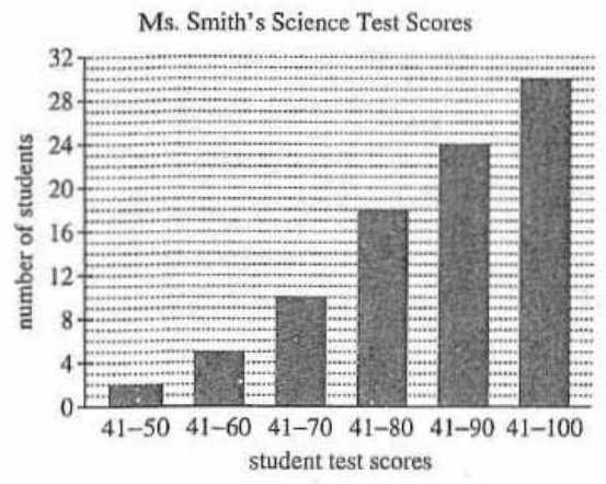
Use the following information to answer Questions 15 – 17
ACT The whole number test scores of all 30 students in Ms. Smith's science class are represented in the cumulative
frequency bar graph below.
(15.) How many students in Ms. Smith's science class had a score greater than 70 on the test?
This is a cumulative frequency bar graph.
Let us draw the frequency table for this graph.
Be reminded that the number of students are cumulative frequencies, so we need to find the frequencies.
Student Test Scores
Number of Students (Cumulative Frequencies)
Frequencies, F
41 – 50
2
$2$
41 – 60
5
$5 - 2 = 3$
41 – 70
10
$10 - 5 = 5$
41 – 80
18
$18 - 10 = 8$
41 – 90
24
$24 - 18 = 6$
41 – 100
30
$30 - 24 = 6$
$\Sigma F = 30$
The number of students in Ms. Smith's science class had a score greater than 70 on the test
is the sum of the frequencies of these classes: 41 – 80; 41 – 90; 41 – 100
= 8 + 6 + 6
= 20 students.
(16.) The students in Mr. Cho's class took the same test as those in Ms. Smith's class.
The number of students in Mr. Cho's class with a score in the range 41 – 50 was 3 less than 4 times the number of students in Ms. Smith's class with a score in the range 41 – 50.
How many students in Mr. Cho's class had a score in the range 41 – 50 on this test?
Let us draw another frequency table for the class intervals and the frequencies
Class Intervals
Frequency, F
41 – 50
2
51 – 60
3
61 – 70
5
71 – 80
8
81 – 90
6
91 – 100
6
$\Sigma F = 30$
Number of students in Ms. Smith's class with a score in the range 41 – 50 = 2 (because the frequency for that class is 2)
Let the number of students in Mr. Cho's class with a score in the range 41 – 50 = p
$
3\;\;less\;\;than\;\;4\;\;times\;\;2 = 4(2) - 3 \\[3ex]
p = 4(2) - 3 \\[3ex]
p = 8 - 3 \\[3ex]
p = 5 \\[3ex]
$
Number of students in Ms. Smith's class with a score in the range 41 – 50 = 5
(17.) SamDom needs to select a simple random sample of three from nine friends who will participate in a survey.
Assume the friends are numbered 1, 2, 3, 4, 5, 6, 7, 8, and 9.
Select three friends, using the second row of digits in the random number table.
Read off each digit, skipping any digit not assigned to one of the friends.
The sampling is without replacement, meaning that he cannot select the same person twice.
Write down the numbers chosen.
(1)
(2)
(3)
(4)
1
37330
87385
32323
71009
2
46254
15935
65321
89215
3
65216
32341
68693
55931
Second row of digits and Without Replacement:
46254 15935 65321 89215
Beginning from left to right:
The numbers of the three subjects selected are: 4, 6, 2
(18.) What determines if a person is left-handed or right-handed?
Scientists for years have suspected that our genes may play a role and have been studying the connection to determine the role of genes in our handedness.
One research study involved 3,394 participants who were tested in their dexterity with each hand to determine the strength of left- versus right-handedness.
The difference in the time needed to complete a task with the left versus right hand was recorded and compared to "a statistical sweep of DNA" (Hesman Saey, 2013).
The study highlighted a particular gene that appeared in previous studies and also identified other genes that may play a role.
How various genes impact handedness has not been fully realized and research is ongoing.
For now, science has concluded only that handedness is a result of genetic variation.
(Source: Hesman Saey, T. "Genes for body symmetry may also control handedness." Science News. 13, Sept 2013.
retrieved from https://www.sciencenews.org/article/genes-body-symmetry-may-also-control-handedness)
Using the information in the above information on gene research, which of the following statements is not true? A. Observational studies have been utilized. B. Gene research related to handedness is ongoing. C. An individual's genes are suspected in determining handedness. D. Handedness is determined by one specific gene.
D. Handedness is determined by one specific gene.
The study highlighted a particular gene that appeared in previous studies and also identified other genes that may play a role.
(19.) ACT Data from a random sample of 335 car owners in a certain city are listed below.
The table indicates the number of owners in 3 age brackets (16–25, 26–45, 46–60) who own cars from 3 car companies (A, B, C) in this city.
Each owner in the sample owns only 1 car.
Car companies
Age (in years)
A
B
C
Total
16–25
26–45
46–60
16
54
65
24
48
23
40
53
12
80
155
100
Total
135
95
105
335
A circle graph will be drawn with 3 sectors each representing the proportion of owners from Company A, B, and C who are 16 to 25 years old.
What is the measure of the central angle for the Company A sector of the graph?
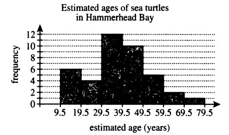
(21.) ACT Marine biologists collected a sample of 40 adult sea
turtles from Hammerhead Bay and estimated the age, in whole years, of each turtle.
The histogram below shows the frequency of sea turtles for each of the estimated age groups.
What is the maximum possible number of sea turtles that could have had an estimated age of 45 years?
45 falls in between 39.5 — 49.5
The height of the rectangular bar (frequency) for those age intervals is 10
This implies that 10 sea turtles from Hammerhead Bay have ages between 39.5 and up to 49.5
This implies that the maximum possible number of sea turtles that could have had an estimated age of 45 years is 10 sea turtles.
(22.) Assume the Centers for Disease Control and Prevention (CDC) conducts an annual Youth Risk Behavior Survey, surveying over 15,000 high school students.
The 2015 survey reported that, while cigarette use among high school youth had declined to its lowest levels, 24% of those surveyed reported using e-cigarettes.
(a.) Identify the sample.
(b.) Idenfify the population.
(c.) Is the value 24% a parameter or a statistic?
(d.) What symbol would we use for the value?
(a.) The sample is the over 15,000 high school students.
(b.) The population is high school students.
(c.) 24% is a statistic.
(d.) It is the sample proportion. The symbol is p̂
Use the following information to answer Questions 23 – 25
ACT In 2012, pollsters for the Gallup Organization asked a random sample of 1,014 adults, "On average, about how much does your family spend on food each week?"
The table below lists the percent of the sample that gave each response.
For example, approximately 21% of adults in the sample responded that, on average, they spend no less than $200 but no more than $299 on food each week.
Average amount spent
Percent of sample
Less than $50 $50 to $99 $100 to $124 $125 to $149 $150 to $199 $200 to $299 $300 or more
Did not give an amount
8%
17%
22%
4%
15%
21%
10%
3%
(23.) Which of the following expressions is equal to the approximate number of adults from the sample that said they spend an average of less than $100 each week on food?
The percent of adults from the sample that said they spend an average of less than $100 each week on food are:
(1.) the percent of adults from the sample that spend no less than $50 and no more than $90 plus
(2.) the percent of adults from the sample that spend less than $50
This is: 17% + 8% = 25%
Therefore, the approximate number of adults from the sample that said they spend an average of less than $100 each week on food
= 25% of 1014
= 0.25(1014)
(24.) What percent of adults in the sample responded that they spend, on average, at least $150 each week on food?
At least $150 means $150 or more
The percent of adults from the sample responded that they spend, on average, at least $150 each week on food are:
(1.) the percent of adults from the sample that spend no less than $150 and no more than $199 plus
(2.) the percent of adults from the sample that spend no less than $200 and no more than $299 plus
(3.) the percent of adults from the sample that spend $300 or more
This is = 15% + 21% + 10%
= 46%
(25.) A pollster will create a circle graph using the information in the table.
One sector of the circle graph will represent the percent of adults in the sample who said they spend on average of $300 or more on food each week.
What will be the measure of the central angle for that sector?
(26.) In 2017 the Gallup poll surveyed 1021 adults in the United States and found that 57% supported a ban on smoking in public places. I. Identify the population II. Identify the sample. III. What is the parameter of interest? IV. What is the statistic?
I. The population is adults in the United States. II. The sample is the 1021 adults surveyed. III. The parameter is the percentage of all adults who support smoking bans. IV. The statistic is the 57% of the sample who supported such a ban.
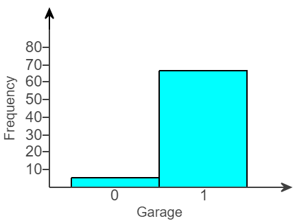
(27.) The accompanying graph shows the distribution of data on whether houses in a large neighborhood have a garage.
(A 1 indicates the house has a garage, and a 0 indicates it does not have a garage.)
(a.) Is this a bar graph or a histogram?
(b.) How could the graph be improved?
(a.) The graph is a histogram because the bars touch.
(b.) The graph could be improved by making it a bar graph or a pie chart. This change would make the variable garage be seen as categories, not as numbers.
(28.) A researcher has designed a survey in which the questions asked do not produce a true answer.
What is this an example of?
A. Nonresponse bias B. Measurement bias C. Voluntary response bias D. Sampling bias
This is Measurement bias
ACT
Use the following information to answer questions 29 and 30
A large theater complex surveyed 5,000 adults.
The results of the survey are shown in the tables below.
Age groups
Number
21 – 30
31 – 40
41 – 50
51 or older
2,750
1,225
625
400
Moviegoer category
Number
Very often
Often
Sometimes
Rarely
830
1,650
2,320
200
Tickets are $9.50 for all regular showings and $7.00 for matinees.
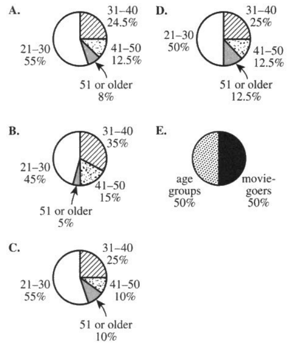
(29.) ACT One of the following circle graphs represents the proportion by age group of the adults
surveyed. Which one?
We have about a minute to solve this question.
So, we shall find the sectorial angle for the first age group and then use the process of elimination to
identify our answer
If necessary, we shall find the sectorial angle for the second age group and also eliminate options
We shall repeat this process until we get our answer
$
Sectorial\;\;\angle\;\;for\;\;each\;\;age\;\;group = \dfrac{frequency\;\;of\;\;the\;\;age\;\;group}{\Sigma f} * 100 \\[5ex]
\underline{21-30\;\;Age\;\;Group} \\[3ex]
Sectorial\;\;\angle = \dfrac{2750}{5000} * 100 \\[5ex]
= 55\% \\[3ex]
$
Eliminate Options B., D., and E.
Let us calculate the sectorial angle for the second age group
$
\underline{31-40\;\;Age\;\;Group} \\[3ex]
Sectorial\;\;\angle = \dfrac{1225}{5000} * 100 \\[5ex]
= 24.5\% \\[3ex]
$
Eliminate Option C.
Option A. is the correct answer.
For those who just want to complete the rest of the age groups
(30.) ACT Suppose all the adults surveyed happened to attend 1 movie each in one particular week.
The total amount spent on tickets by those surveyed in that week was $\$44,000.00$
How many adults attended matinees that week?
$
Let\:\:the: \\[3ex]
Number\:\:of\:\:adults\:\:that\:\:attended\:\:matinees = m \\[3ex]
Number\:\:of\:\:adults\:\:that\:\:attended\:\:regular\:\:showings = r \\[3ex]
Adults:\:\: m + r = 5000...eqn.(1) \\[3ex]
Cost:\:\: 7m + 9.5r = 44000...eqn.(2) \\[3ex]
To\:\:find\:\:m, \:\:eliminate\:\: r \\[3ex]
9.5 * eqn.(1) \implies 9.5m + 9.5r = 47500...eqn.(3) \\[3ex]
eqn.(3) - eqn.(2) \implies \\[3ex]
(9.5m - 7m) + (9.5r - 9.5r) = 47500 - 44000 \\[3ex]
2.5m = 3500 \\[3ex]
m = \dfrac{3500}{2.5} \\[5ex]
m = 1400 \\[3ex]
$
$1400$ adults attended matinees that week.
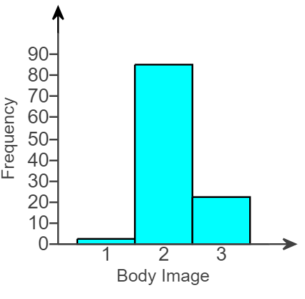
(31.) A student has gathered data on self-perceived body image, where 1 represents "underweight," 2 represents "about right," and 3 represents "overweight."
A graph of these data is shown below.
What type of graph would be a better choice to display these data, and why?
A better choice would be a bar graph or pie chart because the data set is categorical.
The numbers 1, 2, and 3 represent categories, so a histogram should not be used.
(32.) When reading about a survey, which of the following is important to know? A. What percentage of people who were asked to participate actually did so B. Whether the researchers chose people to participate in the survey or people themselves chose to participate C. How many questions were in the survey D. Both A and B E. A, B and C
It is important to know whether there is nonreponse bias, which can be judged based on what percentage of people who were asked to participate actually did so,
or voluntary response bias, which can be judged by whether the researchers chose people to participate in the survey or people themselves chose to participate.
Therefore, it is important to know both A and B
(33.) ACT The frequency chart below shows the cumulative number of Ms. Hernandez's science students whose
test scores fell within certain score ranges.
All test scores are whole numbers.
Score range
Cumulative number of students
65 – 70
65 – 80
65 – 90
65 – 100
12
13
19
21
How many students have a test score in the interval 71 – 80?
This is a case of cumulative frequency
The number of students who scored in the interval: 65 – 70
plus
The number of students who scored in the interval: 71 – 80
equals
The number of students who scored in the interval: 65 – 80
Therefore: 12 + what = 13
what = 13 − 12
what = 1
1 student scored in the interval: 71 – 80
(34.) Assume you are receiving a large shipment of batteries and want to test their lifetimes. Explain why you would want to test a sample of batteries rather than the entire population. A. If you test all the batteries to failure you would have no batteries to sell. B. If you test all the batteries you cannot form any conclusions about the population. C. The percentage of defective batteries can change in the time it takes you to test all the batteries.
The correct option is A.
If you test all the batteries to failure you would have no batteries to sell.
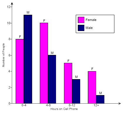
(35.) The graph shows the time spent on a typical day talking on the cell phone for some men and women.
Each person was asked to choose the one of four intervals that best fitted the amount of time they spent on the phone (for example, "0 to 4 hours" or "12 or more hours").
(a.) Identify the two variables.
State whether they are categorical or numerical and explain.
(b.) Is the graph a bar chart or a histogram?
Which would be the better choice for these data?
(c.) If you had the actual number of hours for each person, rather than just an interval, what type of graph should you use to display the distribution of the actual numbers of hours?
(d.) Compare the modes of the two distributions, and interpret what you discover.
What does this say about the difference between men's and women's cell phone use?
(a.) The two variables sttaed in the question are:
(i.) Gender: is a categorical variable because it describes qualities
(ii.) Time range: is a categorical variable because it describes qualities
(b.) The graph is a bar chart.
It is the better choice since both variables are categorical.
(c.) Two histograms should be used since the time would be a numerical variable.
(d.) The mode for women is 4 – 8 hours because it is the tallest bar for women.
The mode for men is 0 – 4 hours because it is the tallest bar for men.
Therefore, the distributions show that women talk more.
(36.) Say you want to estimate the mean GPA of all students at your school.
You set up a table in the library asking for volunteers to tell you their GPAs.
Do you think you would get a representative sample? Why or why not? A. One would probably get a representative sample because the sample is random and was collected without replacement (no subject is selected more than once).
B. One would probably not get a representative sample because of sampling bias (students who volunteer will probably have higher GPAs than students who don't volunteer) and response bias (students may inflate their GPAs).
C. One would probably not get a representative sample because of response bias (students who volunteer will probably have higher GPAs than students who don't volunteer) and measurement bias (students may inflate their GPAs).
D. One would probably get a representative sample because the sample was collected using simple random sampling.
If one attempts this, we do know there are about two groups of students that will show up:
(a.) Students who are true to their consciences that show up are mainly those with high GPAs.
Students with high GPAs will most likely, easily say their GPAs even in situations when they are not asked, not to mention when they are asked.
This is because high GPA is worth bragging about. 😊
This is Response Bias
(b.) Some students who may feel pressured to come to the library or who are social media influencers or socialites or publicists (especially if the event is a public event)
are likely to attend and falsify/inflate their GPAs.
This is Measurement Bias.
Hence, the correct option is C.
One would probably not get a representative sample because of response bias (students who volunteer will probably have higher GPAs than students who don't volunteer) and measurement bias (students may inflate their GPAs).
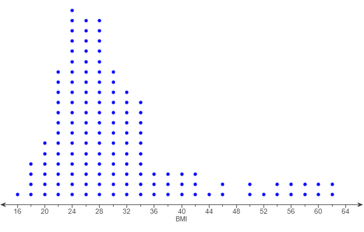
(37.) The dotplot shows the body mass index (BMI) for 141 randomly surveyed people from a certain country.
(a.) A BMI of more than 40 is considered morbidly obese.
Report the number of morbidly obese shown in the dotplot.
(b.) Report the percentage of people who are morbidly obese.
Compare this with a recent estimate that 3% of people from the country were morbidly obese.
(a.) Scale on the dotplot is 2 units
More than 40:
BMI of 42 = 3 people
BMI of 44 = 1 person
BMI of 46 = 2 people
BMI of 48 = 0 people
BMI of 50 = 2 people
BMI of 52 = 1 person
BMI of 54 = 2 people
BMI of 56 = 2 people
BMI of 58 = 2 people
BMI of 60 = 2 people
BMI of 62 = 2 poeple
BMI of 64 = 0 person
Σ Number of morbidly obese people = 19 people
According to the dotplot, 19 people are considered morbidly obese.
(b.) The percentage of people who are considered morbidly obese
$
= \dfrac{n(morbidly\;\;obese)}{\Sigma F} * 100 \\[5ex]
= \dfrac{19}{141} * 100 \\[5ex]
= \dfrac{1900}{141} \\[5ex]
= 13.475177305 \\[3ex]
\approx 13\%...to\;\;the\;\;nearest\;\;whole\;\;number \\[3ex]
$
This implies that the percentage of morbidly obese people in the survey (≈ 13%) is greater than
the estimated percentage of people that are considered morbidly obese. (3%)
(38.) Explain the difference between sampling with replacement and sampling without replacement.
Say you had the names of 10 students, each written on a 3 by 5 notecard, and want to select two names.
Describe sampling with replacement.and sampling without replacement.
A. Draw a notecard, note the name, replace the notecard and draw again.
It is not possible the same student could be picked twice.
B. Draw a notecard, note the name, replace the notecard and draw again.
It is possible the same student could be picked twice.
C. Draw a notecard, note the name, do not replace the notecard and draw again.
It is possible the same student could be picked twice.
D. Draw a notecard, note the name, do not replace the notecard and draw again.
It is not possible the same student could be picked twice.
Sampling with replacement:
Draw a notecard, note the name, replace the notecard and draw again.
It is possible the same student could be picked twice.
Sampling without replacement:
Draw a notecard, note the name, do not replace the notecard and draw again.
It is not possible the same student could be picked twice.
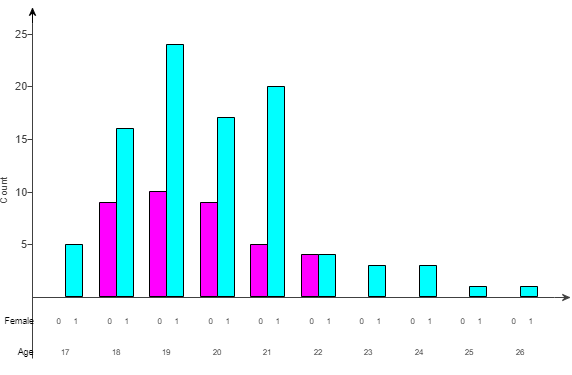
(39.) The graph shows ages of females (labeled 1) and males (labeled 0) who are majoring in psychology in a four-year college.
(a.) Is the graph a histogram or a bar graph? How do you know?
(b.) What type(s) of graph(s) would be more appropriate?
(a.) The graph is a bar graph because the bars are separated.
(b.) Two histograms or a pair of dot plots with a common horizontal axis would be more appropriate since the given data are numerical.
(40.) Consider an experiment designed to test whether cash incentives improve school attendance.
The researcher chooses two groups of 100 high school students.
She offers one group $10 for every week of perfect attendance.
She tells the other group that they are part of an experiment but does not give them any incentive.
(a.) Identify the treatment group.
(b.) Identify the control group.
(a.) The students who received an incentive represent the treatment group.
(b.) The students who do not receive an incentive represent the control group.
(41.) Dominic needs to select a simple random sample of two from six friends who will participate in a survey.
Assume the friends are numbered 1, 2, 3, 4, 5, and 6.
Use the line from a random number table shown below to select the sample.
Begin from the left.
0 5 8 5 7 8 1 4 9 9 7 2 4 3 5 2 1 1
0 6 7 5 5 1
Beginning from then left and Without replacement: 1st Batch of Numbers
0: Not among the numbered friends: Skip
5: Okay...first friend selected
8: Not among the numbered friends: Skip
5: Has already been selected: Skip
7: Not among the numbered friends: Skip
8: Not among the numbered friends: Skip
2nd Batch of Numbers
1: Okay...second friend selected
The two friends selected are: 5 and 1
(42.) The existence of multiple mounds in a distribution is sometimes a sign of which of the following?
A. The data is not from a random sample. B. All the values in the data are centered around one typical value. C. The graph of the distribution was drawn incorrectly. D. Two or more very different groups have been combined into a single collection.
D. Two or more very different groups have been combined into a single collection.
Sometimes, the presence of multiple mounds can indicate that there have been multiple groups combined into a single sample.
For example, if a group that has a right-skewed distribution were combined with a group that has a left-skewed distribution, the result would be a sample that has two mounds.
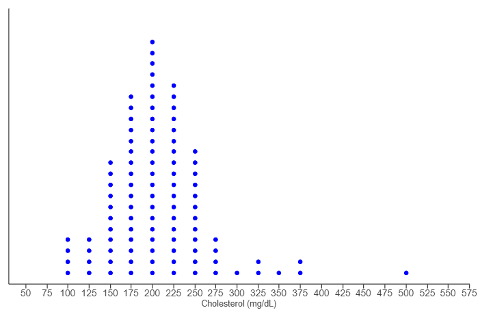
(43.) The dotplot shows the cholesterol level of 99 adults from a survey in 2010.
(a.) A total cholesterol level of 240 mg/dL (milligrams per deciliter) or more is considered unhealthy.
Report the number of people in this group with unhealthy cholesterol levels.
(b.) Knowing that there are a total of 99 people in this sample, report the percentage of people with unhealthy total cholesterol levels.
How does this compare with an estimate from 2010 that 18% of people had unhealthy cholesterol levels?
(a.) Scale on the dotplot is 25 units
240 mg/dl or more:
Cholesterol level of 250 = 12 people
Cholesterol level of 275 = 4 people
Cholesterol level of 300 = 1 person
Cholesterol level of 325 = 2 people
Cholesterol level of 350 = 1 person
Cholesterol level of 375 = 2 people
Cholesterol level of 500 = 1 person
Σ Number of morbidly obese people = 23 people
There are 23 people in this group with unhealthy cholesterol levels.
(b.) The percentage of people from this sample with unhealthy total cholesterol levels is:
$
= \dfrac{n(unhealthy\;\;cholesterol\;\;levels)}{\Sigma F} * 100 \\[5ex]
= \dfrac{23}{99} * 100 \\[5ex]
= \dfrac{2300}{99} \\[5ex]
= 23.23232323 \\[3ex]
\approx 23.2\%...to\;\;1\;\;decimal\;\;place \\[3ex]
$
This implies that the percentage of people from this sample with unhealthy total cholesterol levels (≈ 23.2%) is more than
the estimate (18%).
(44.) Assume your class has 30 students and you want a random sample of 10 of them.
A student suggests asking each student to flip a coin, and if the coin comes up heads, then he or she is in your sample.
Explain why this is not a good sampling approach.
A. This method is not good because it is not random. B. This method is not good because it will result in sampling bias. C. This method is not good because it will likely result in measurement bias. D. This method is not good because it is unlikely to result in a sample size of 10.
What if there are more than 10 students whose coin flips turned up heads?
You will then have to deal with how to select only 10 that are needed.
OR
What if there are less than 10 students whose coin flips turned up heads?
It is possible that 21 students had their coin flips land on tails.
So, this approach is not reliable.
It is not a good approach because it is not likely to result in a sample size of 10.
(45.) A school district conducts a survey to determine whether voters favor passing a bond to fund school renovation projects.
All registered voters are called.
Of those called, 10% answer the survey call.
Of those who respond, 70% say they favor passing the bond.
Give a reason why the school district should be cautious about predicting that the bond will pass.
A. This was only one survey and people's opinions change over time.
B. There is nonresponse bias.
The results could be biased because the small percentage who chose to return the survey might be very different from the majority who did not return the survey.
C. The entire population was surveyed and therefore inferences cannot be drawn.
D. There is measurement bias.
The questions could have been worded in such a way that the respondents' responses were influenced.
Let's assume the number of registered voters = 1000
10% (0.1 * 1000 = 100) responded to the survey.
90% (0.9 * 1000 = 900) did not respond.
So, only very few responded to the survey.
There is already a bias: Nonresponse Bias because a lot of people did not respond to the survey.
Of those who responded:
70% (0.7 * 100 = 70) are in favor of passing the bond.
So, 930 (1000 - 70 = 930) voters may probably would not have been in favor of passing the bond.
The survey is biased.
B. There is nonresponse bias.
The results could be biased because the small percentage who chose to return the survey might be very different from the majority who did not return the survey.
(46.) Indicate whether each study is an observational study or a controlled experiment.
(a.) A local public school encourages, but does not require, students to wear uniforms.
The principal of the school compares the grade point averages of students at this school who wear uniforms with the GPAs of those who do not wear uniforms to determine whether those wearing uniforms tend to have higher GPAs.
(b.) A student watched picnickers with a large cooler of soft drinks to see whether teenagers were less likely than adults to choose diet soft drinks over regular soft drinks.
(c.) A researcher is interested in the effect of music on memory.
She randomly divides a group of students into three groups: those who will listen to quiet music, those who will listen to loud music, and those who will not listen to music.
After the appropriate music is played (or not played), she gives all the students a memory test.
(d.) Patients with multiple sclerosis are randomly assigned a new drug or placebo and are then given a test of coordination after six months.
(e.) A group of boys is randomly divided into two groups.
One group watches violent cartoons for one hour, and the other group watches cartoons without violence for one hour.
The boys are then observed to see how many violent actions they take in the next two hours, and the two groups are compared.
(f.) Patients with Alzheimer's disease are randomly divided into two groups.
One group is given a new drug, and the other is given a placebo.
After six months they are given a memory test to see whether the new drug fights Alzheimer's better than a placebo.
(a.) This is an observational study.
The principal does not randomly assign students to either wear or not wear uniforms.
Random assignment is essential to conducting a controlled experiment.
(b.) This is an observational study.
(c.) This is a controlled experiment.
She assigns students to the control and treatment groups at random in order to control for all relevant factors aside from the effect of music on memory, which is essential to conducting a controlled experiment.
(d.) This is a controlled experiment because the patients were assigned drugs by those conducting the study.
(e.) The study is a controlled experiment.
(f.) This is a controlled experiment.
The researchers randomly assigned patients to either a treatment or control group, and they gave the patients a test afterwards to identify the effect of the new drug.
This satisfies a key criterion of controlled experiments.
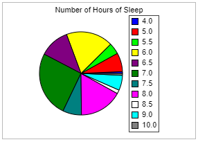
(47.) The pie chart reports the number of hours of sleep "last night" for 116 college students.
(I.) What would be a better type of graph for displaying these data? Select all that apply.
A. Bar Chart. B. Histogram. C. Dot Plot. D. Pareto Chart.
(II.) Explain why this pie chart is hard to interpret.
A. The sample of students is too large causing too many different results for the number of hours of sleep. B. There are so many possible numerical values causing the pie chart to have too many "slices", which makes it difficult to tell which is which. C. The colors chosen for the chart are too similar making it hard to tell which "slice" goes to what category. D. The pie chart only shows the proportions of the students who got a certain number of hours of sleep, not the frequency of students who got a certain number of hours of sleep.
(I.) B. Histogram. C. Dot Plot.
This is because the data: number of hours of sleep "last night" for 116 college students is numerical.
If the variable is numerical, a dotplot, histogram, or stemplot is used.
(II.) B. There are so many possible numerical values causing the pie chart to have too many "slices", which makes it difficult to tell which is which.
(48.) ACT A random number generator that generates an integer 1 through 6 will be used 15,000 times.
Each time an integer is generated, the number will be recorded.
Which of the following descriptors will most likely characterize the distribution of the 15,000 recorded numbers? F. Bimodal G. Normal H. Skewed left J. Skewed right K. Uniform
Random Number Generator: the event is random
Each outcome of the event: : 1, 2, 3, 4, 5, 6 has an equal likelihood of occurrence. In other words, the
probability of obtaining each of the outcomes is the same
Hence, the distribution of the 15,000 is a uniform distribution.
(49.) A teacher at a community college sent out questionnaires to evaluate how well the administrators were doing their jobs.
All teachers received questionnaires, but only 10% returned them.
Most of the returned questionnaires contained negative comments about the administrators.
Explain how an administrator could dismiss the negative findings of the report.
A. The entire population was surveyed and therefore inferences cannot be drawn.
B. This was only one survey and people's opinions change over time.
C. There is measurement bias.
The questions could have been worded in such a way that the respondents responses were influenced.
D. There is nonresponse bias.
The results could be biased because the small percentage who chose to return the survey might be very different from the majority who did not return the survey.
Let's assume the number of teachers = 1000
All teachers received the questionnaires.
But only 10% (0.1 * 1000 = 100) returned them.
90% (0.9 * 1000 = 900) did not return the questionnaires.
So, only very few responded.
There is already a bias: Nonresponse Bias because a lot of people did not respond to the survey.
D. There is nonresponse bias.
The results could be biased because the small percentage who chose to return the survey might be very different from the majority who did not return the survey.
(50.) Consider an experiment designed to test whether cash incentives improve school attendance.
The researcher chooses two groups of 100 high school students.
She offers one group $10 for every week of perfect attendance.
She tells the other group that they are part of an experiment but does not give them any incentive.
How would you describe the experiment above?
A. The experiment is not blind because the researcher and students know which groups the students are in. B. The experiment is double-blind because no one knows which group the students are in. C. The experiment is single-blind because the researcher only paid one group of students. D. It cannot be determined from the information given.
The correct answer is A.
The experiment is not blind because the researcher and students know which groups the students are in.
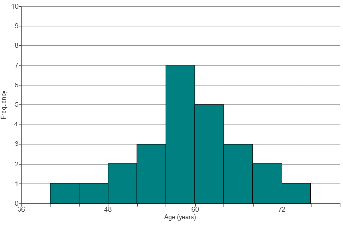
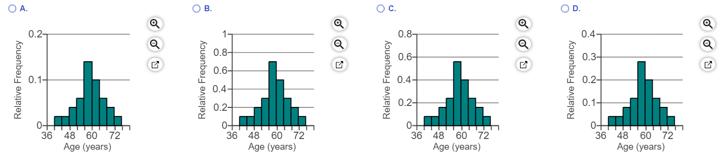
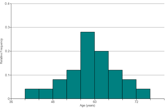
(51.) The histogram shows frequencies for the ages of 25 randomly selected CEOs.
Convert this histogram to one showing relative frequencies by relabeling the vertical axis with the appropriate
relative frequencies.
Note that the new labels for the vertical axis are the only thing that will change.
Choose the correct graph below.
To find the bin width:
$
Bin\;\;width = \dfrac{48 - 36}{3} = \dfrac{12}{3} = 4 \\[5ex]
$
Let us construct a relative frequency table for the histogram of the data
Age (Years)
Frequency, F
Relative Frequency, RF
36 – 40
0
$
\dfrac{0}{25} = 0
$
40 – 44
1
$
\dfrac{1}{25} = 0.04
$
44 – 48
1
$
\dfrac{1}{25} = 0.04
$
48 – 52
2
$
\dfrac{2}{25} = 0.08
$
52 – 56
3
$
\dfrac{3}{25} = 0.12
$
56 – 60
7
$
\dfrac{7}{25} = 0.28
$
60 – 64
5
$
\dfrac{5}{25} = 0.2
$
64 – 68
3
$
\dfrac{3}{25} = 0.12
$
68 – 72
2
$
\dfrac{2}{25} = 0.08
$
72 – 76
1
$
\dfrac{1}{25} = 0.04
$
Reviewing all the options, we notice that the bar with the highest frequency of 7, (56 – 60) has a relative frequency of 0.28
This implies that the correct option is D.
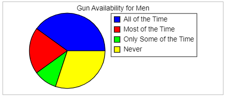
(52.) A survey asked gun owners what percentage of the time they had a loaded gun easily within reach when at home.
The results for male gun owners are displayed in a bar chart and a pie chart.
Gun Availability Bar Chart
Gun Availability Pie Chart
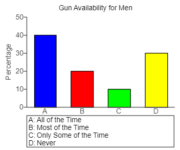
(a.) Which period was most frequent?
(b.) Use the graphs to estimate the difference in the percentage responding "All the Time" and "Never."
(c.) Is this easier to estimate using the bar chart or the pie chart?
(a.) The blue color key of Never was the most frequent period.
(b.) Using the bar graph:
The percentage responding "All the Time" (A) is 40%
The percentage responding "Never" (D) is 30%
Difference = 40% - 30% = 10%
(c.) It is easier to use a bar chart because you can compare values using the heights of the bars, whereas it can be hard to determine which of two slices in a pie chart is larger when they are close in size and not adjacent to each other.
(53.) In carrying out a study on views of capital punishment, a student asked a question the two ways shown below.
(I.) With persuasion:
"My brother has been accused of murder and he is innocent.
If he is found guilty, he might suffer capital punishment.
Now do you support or oppose capital punishment?"
(II.) Without persuasion:
"Do you support or oppose capital punishment?"
Support of capital punishment based on gender.
Men
With Persuasion
No Persuasion
For capital punishment
8
13
Against capital punishment
7
2
Women
With Persuasion
No Persuasion
For capital punishment
3
3
Against capital punishment
7
7
(a.) What percentage of those questioned with persuasion support capital punishment?
(b.) What percentage of those questioned without persuasion support capital punishment?
(c.) Compare the percentages in parts (a.) and (b.)
Is this what you expected? Explain. Select one option. A. The student spoke against capital punishment, and fewer who heard her statements against it supported capital punishment, compared to those who did not hear the student's persuasion.
B. The student spoke against capital punishment, and more people who heard her statements against it supported capital punishment, compared to those who did not hear the student's persuasion.
C. The percentage of people who supported capital punishment was the same whether or not they heard the student's persuasion.
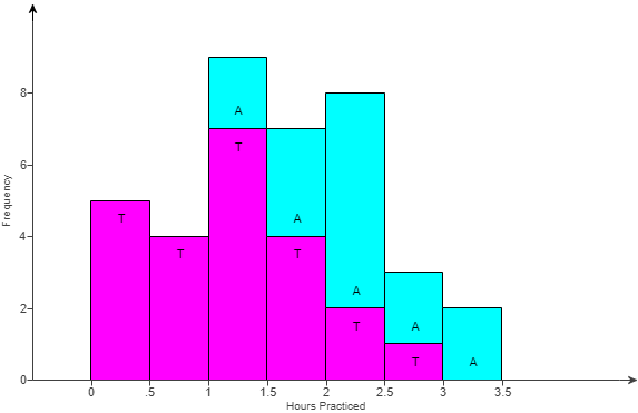
(54.) The graph is a special histogram with additional information; it was made using StatCrunch.
People who studied music as children were asked how many hours a day they practiced when they were teenagers, and also whether they still play now that they are adults.
To understand the graph, look at the third bar (spanning 1.0 to 1.5); it shows that there were seven people (the lower part of the bar, colored in fuschia and labeled "T") who practiced between 1.0 and 1.5 hours and did not still play as adults, and there were two people (the upper part of the bar, colored in light blue and labeled "A") who practiced 1.0 to 1.5 hours and still play as adults.
(a.) Comment on what the graph shows.
(b.) What other types of graphs could be used for this data set?
(a.) Let us analyze the special histogram:
Time Range (hours)
Number of Teenagers (T)
Number of Adults (A)
0 to up to 0.5
5
0
0.5 to up to 1
4
0
1 to up to 1.5
7
9 (7 + 2)
1.5 to up to 2
4
7 (4 + 3)
2 to up to 2.5
2
8 (2 + 6)
2.5 to up to 3
1
3 (1 + 2)
3 to up to 3.5
0
2
Σ T = 23
Σ A = 29
$
\underline{Teenagers} \\[3ex]
\dfrac{\Sigma T}{2} = \dfrac{23}{2} = 11.5 \\[5ex]
5 + 4 + 2.5 ...2.5\;\;in\;\;7 \implies 1 - 1.5 \\[3ex]
Center\;\;is\;\;in\;\;1 - 1.5 \\[3ex]
\underline{Adults} \\[3ex]
\dfrac{\Sigma A}{2} = \dfrac{29}{2} = 14.5 \\[5ex]
0 + 0 + 9 + 5.5 ...5.5\;\;in\;\;7 \implies 1.5 - 2 \\[3ex]
Center\;\;is\;\;in\;\;1.5 - 2 \\[3ex]
$
Those who still play tended to have practiced more as teenagers, which can be seen because the typical value, or center, of the distribution for those who still play is 2 to 2.5 hours compared to 1 to 1.5 hours for those how do not.
(b.) The other types of graphs that could be used for this data set are:
A pair of dotplots
A pair of histograms
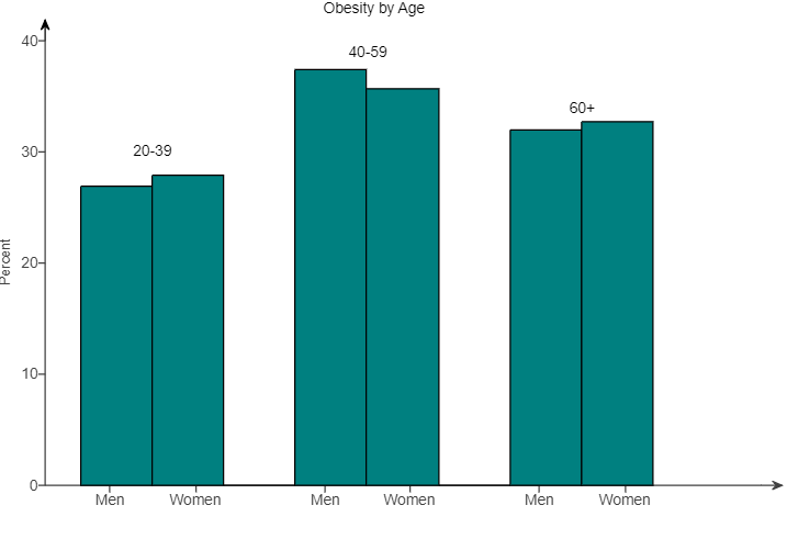
(55.) Data on obesity rates for adults in a certain region are displayed in the bar plot for three age groups.
(a.) Which age group typically has the highest rate of obesity?
(b.) Comment on any similarities and differences in the obesity rates of men and women.
(a.) The age group that has the highest rate of obesity is: 40 — 59 because it has the tallest bars.
(b.) The obesity rates for women are slightly higher in the 20 — 39 and 60+ age groups.
The obesity rate for men is higher in the 40 — 59 age group.
(56.) What is the first step in almost every investigation of data?
A. Make an appropriate graph. B. Determine if the data contain any outliers. C. Describe the variability. D. Determine the center.
A. Make an appropriate graph.
The first step in every investigation of data is to make an appropriate graph.
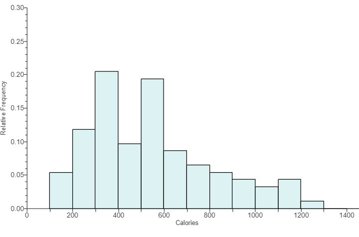
(57.) The histogram shows the number of calories in a sample of fast-food items.
(a.) What is the bin width of the histogram?
(b.) Would this graph be best described as unimodal or bimodal?
(c.) Approximately what percentage of the fast-food items contained fewer than 300 calories?
(a.) To find the bin width:
$
Bin\;\;width = \dfrac{200 - 0}{2} = \dfrac{200}{2} = 100 \\[5ex]
$
(b.) Because the histogram has only two peaks (though they are not approximately equal in height), the graph is best described as bimodal because there are two modes.
(c.) Scale on the Calories axis = bin width = 100 units
Σ Fewer than 300 calories = 5% + 12% = 17%
Approximately 17% of the fast-food items contained fewer than 300 calories.
(58.) Which of the following is a reason we can never draw cause-and-effect conclusions from observational studies?
A. Researchers may be biased in the observations they choose to record.
B. Observational studies often do not involve a large enough sample to draw cause-and-effect conclusions.
C. Potential confounding variables may explain the differences between groups rather than the treatment variable.
D. Observational studies are not scientific in nature.
C. Potential confounding variables may explain the differences between groups rather than the treatment variable.
(59.) Make the two given tables into one table by combining men for capital punishment into one group, men opposing it into another, women for it into one group, and women opposing it into another.
The student who collected the data could have made the results misleading by trying persuasion more often on one gender than on the other, but she did not do this.
She used persuasion on 10 of 20 women (50%) and on 15 of 30 men (50%).
Support of capital punishment based on gender.
Men
With Persuasion
No Persuasion
For capital punishment
4
12
Against capital punishment
11
3
Women
With Persuasion
No Persuasion
For capital punishment
4
5
Against capital punishment
6
5
(a.) Make a two-way table described in the problem statement.
(b.) Of the 30 men sampled, what percentage support capital punishment?
Round to one decimal place as needed.
(c.) Of the 20 women sampled, what percentage support capital punishment?
Round to one decimal place as needed.
(d.) On the basis of these results, for someone who is an advocate for life and does not support capital punishment, would the person want men or women on any jury for murder trial?
(a.)
Men that support capital punishment
= Men who support capital punishment with persuasion + Men who support capital punishment without persuasion
= 4 + 12
= 16
Men against capital punishment
= Men against capital punishment with persuasion + Men against capital punishment without persuasion
= 11 + 3
= 14
Women that support capital punishment
= Women who support capital punishment with persuasion + Women who support capital punishment without persuasion
= 4 + 5
= 9
Women against capital punishment
= Women against capital punishment with persuasion + Women against capital punishment without persuasion
= 6 + 5
= 11
Men
Women
For capital punishment
16
9
Against capital punishment
14
11
$
(b.) \\[3ex]
n(Men) = 16 + 14 = 30 \\[3ex]
n(Men\;\;who\;\;support\;\;capital\;\;punishment) = 16 \\[3ex]
\%(Men\;\;who\;\;support\;\;capital\;\;punishment) \\[3ex]
= \dfrac{n(Men\;\;who\;\;support\;\;capital\;\;punishment)}{n(Men)} * 100 \\[5ex]
= \dfrac{16}{30} * 100 \\[5ex]
= 53.33333333 \\[3ex]
\approx 53.3\% \\[3ex]
(c.) \\[3ex]
n(Women) = 9 + 11 = 20 \\[3ex]
n(Women\;\;who\;\;support\;\;capital\;\;punishment) = 9 \\[3ex]
\%(Women\;\;who\;\;support\;\;capital\;\;punishment) \\[3ex]
= \dfrac{n(Women\;\;who\;\;support\;\;capital\;\;punishment)}{n(Women)} * 100 \\[5ex]
= \dfrac{9}{20} * 100 \\[5ex]
= 45\% \\[3ex]
$
(d.) Based on these results, for any jury for murder trial,
a jury of women would be preferable because a higher percentage of them (100 - 45% = 55%) are not in
favor of capital punishment.
(60.) For the following scenarios, identify and write the symbols, as applicable the:
(a.) population mean
(b.) population proportion
(c.) sample mean
(d.) sample proportion
(I.) A city provides an open data set of commercial building energy use.
Each row of the data set represents a commercial building.
A sample of 250 buildings from the data set has a mean floor area of 36,790 square feet.
Of the sample, 26% were office buildings.
(II.) A city provides an open data set of the number of WiFi sessions at all of its public libraries.
For 2014, there were an average of 423,930.5 WiFi sessions per month at all the public libraries in this city.
(III.) Chapman University conducts an annual Survey of American Fears.
One of the objects of this survey is to collect annual data on the fears, worries, and concerns of Americans.
In 2017 the survey sampled 1207 participants.
One of the survey findings was that 16% believe that Bigfoot is a real creature.
(IV.) The Centers for Disease Control and Prevention (CDC) conducts an annual Youth Risk Behavior Survey, surveying over 15,000 high school students.
The 2015 survey reported that, while cigarette use among high school youth had declined to its lowest levels, 24% of those surveyed reported using e-cigarettes.
(I.) The sample mean, $\bar{x}$ = 36790
The sample proportion, $\hat{p}$ = 26%
(II.) The population mean, μ = 423,930.5
(III.) The sample is the 1207 participants.
The population is people in the United States.
The sample proportion, $\hat{p}$, a statistic = 16%
(IV.) The sample is the over 15,000 high school students.
The population is high school students.
The sample proportion, $\hat{p}$, a statistic = 24%
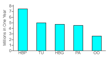
(61.) According to an organization, there are five leading causes of preventable death in a region.
They are shown in the Pareto chart below, where HBP is High Blood Pressure, TU is Tobacco Use, HBG is High Blood Glucose, PA is Physical Activity, and OO and Overweight and Obesity.
(a.) Estimate how many preventable deaths result from high blood pressure.
(b.) Estimate how many preventable deaths result from tobacco use.
(c.) Does this graph support the theory that the greatest rate of preventable death comes from overweight and obesity, as some people have claimed?
(a.) Approximately 7.5 million preventable deaths in one year result from high blood pressure.
(b.) Approximately 5 million preventable deaths in one year result from tobacco use.
(c.) No, the graph does not support the theory that the greatest rate of preventable death comes from overweight and obesity, because overweight and obesity do not cause the greatest number of preventable deaths.
(62.) Is simple random sampling usually done with or without replacement?
A. Simple random sampling is usually done without replacement, which ensures that unbiased samples are more likely to be chosen than biased samples of the same size.
B. Simple random sampling is usually done with replacement, which means that a subject can be selected for a sample more than once.
C. Simple random sampling is usually done without replacement, which means that a subject cannot be selected for a sample more than once.
D. Simple random sampling is usually done with replacement, which ensures that unbiased samples are more likely to be chosen than biased samples of the same size.
C. Simple random sampling is usually done without replacement, which means that a subject cannot be selected for a sample more than once.
(63.) A large collection of one-digit random numbers should have about 50% odd and 50% even digits
because five of the ten digits are odd (1, 3, 5, 7, and 9) and five are even (0, 2, 4, 6, and 8).
(a.) Find the proportion of odd-numbered digits in the following lines from a random number table.
Count carefully.
Round to two decimal places as needed.
9 2 0 7 8
6 7 8 6 6
1 3 6 9 1
1 8 9 2 8
3 1 4 7 4
5 5 3 0 9
(b.) Does the proportion found in part (a) represent $\hat{p}$ (the sample proportion) or p (the population proportion)?
(c.) Determine the error in this estimate, the difference between $\hat{p}$ and p (or $\hat{p} - p$)
Round to two decimal places as needed.
$
(a.) \\[3ex]
Number\;\;of\;\;odd-numbered\;\;digits = 16 \\[3ex]
Sample\;\;size = 30 \\[3ex]
Sample\;\;proportion = %\;\;of\;\;odd-numbered\;\;digits = \dfrac{16}{30} * 100 = 53.33333333\% \\[5ex]
$
The given random number table consists of 53.33% odd-numbered digits.
(b.) The proportion found in part (a) represents $\hat{p}$ (the sample proportion)
(64.) What is the most common trick to mislead readers of bar graphs?
A. Change the color of the bars to make some categories appear more important than others.
B. Change the scale of the vertical axis so that it does not start at 0.
C. Change the scale of the horizontal axis so that it does not start at 0.
D. Change the width of the bars to make some categories appear more important than others.
B. Change the scale of the vertical axis so that it does not start at 0.
By changing the vertical axis so that it does not start at 0, minor differences in the heights of the bars can be exaggerated to look very significant.
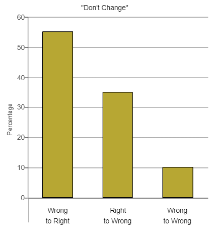
(65.) One of the authors wanted to determine the effect of changing answers on multiple-choice tests.
She studied the tests given by another professor, who had told his students before their exams that if they had doubts about an answer they had written, they would be better off not changing their initial answer.
The author went through the exams to look for erasures, which indicate that the first choice was changed.
In these tests, there is only one correct answer for each question.
The results of her study is presented below:
No because 55% of the changes were from a wrong answer to a right answer, while only 35% were from a right answer to a wrong answer.
Thus, more than half of the erasures resulted in the student getting a question right when they would have gotten it wrong if they had not changed their answer.
(66.) Which of the following is NOT one of the criteria for the "gold standard" for experiments?
A. Double-blinding, in which neither the subjects nor researchers know who is in which group.
B. Large sample size.
C. Random assignment of subjects to treatment or control groups.
D. Equal sample sizes for control and treatment group.
D. Equal sample sizes for control and treatment group.
(67.)
(68.) Which of the following is not a way in which the Internet is influencing statistical graphics?
A. Allowing for a greater variety of graphical displays. B. Decreasing the use of misleading graphics. C. Increasing the use of interactive displays. D. None of the above.
B. Decreasing the use of misleading graphics.
The Internet is not decreasing the use of misleading graphics. (Compare to Fake News!)
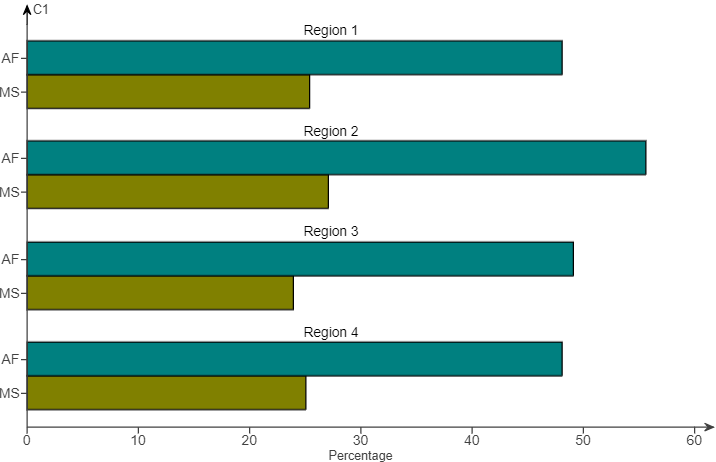
(69.) Data on the percentage of adults living in a certain area who meet the federal aerobic fitness (AF) and muscle strengthening (MS) standards are displayed in the bar plot.
(a.) Comment on the fitness similarities and differences in these four regions.
(b.) Comment on the similarities and differences in aerobic and muscle-strengthening fitness among adults in this area.
(a.) Fitness rates are slightly higher in Region 2 than in the other three regions.
(b.) In each region, aerobic fitness rates were higher than muscle-strengthening rates.
(70.) For these scenarios: describe a bar chart that would have the:
(a.) least variability
(b.) most variability
(I.) Suppose a group of school age children is asked, "Which of these three ice cream flavors do you like the most: vanilla, chocolate, or strawberry?"
(II.) 500 applicants to California community colleges are asked to indicate one of these education goals at the time of application: transfer to a four-year institution, an AA (Associate of Arts) degree, a CTE (Career abd Technical Education) certificate, job retraining, or personal enrichment.
(I.)
(a.) A bar graph with the least variability would be one in which the children favored one particular flavor, for example chocolate.
(b.) A bar graph with the most variability would be one in which the same number of children favored each flavor.
(II.)
(a.) A bar graph with the least variability would be one where most of the applicants had the same education goal, for example to transfer.
(b.) A bar graph with the most variability would be one in which the applicants were equally divided among the five choices.
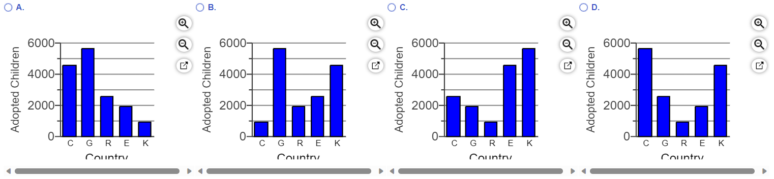
(71.) The accompanying table gives information on the top five countries from which residents of a particular country adopted children one year.
Sketch an appropriate graph of the distribution, and comment on its important features.
Adoptions
Country
Number
Country C
4561
Country G
5641
Country R
2526
Country E
1896
Country K
909
(a.) One type of graph appropriate for showing this distribution is a bar chart.
Which of the following bar charts correctly shows the given distribution?
(b.) What other appropriate graphs cana be used for showing the given distribution?
(c.) Which of the following is the best description of the distribution's important features?
(a.) Country G has the highest number of adopted children.
So, Options C and D are eliminated, leaving us with Options A and B
Country G has the lowest number of adopted children.
This eliminates Option B, leaving us with Option A.
The bar chart that correctly shows the given distribution is: Option A.
(b.) Other appropriate graphs that can be used for showing the given distribution are:
Pareto charts and Pie charts because they are suited for presenting categorical variables.
(c.) The mode is Country G and the overall distribution has a high variation.
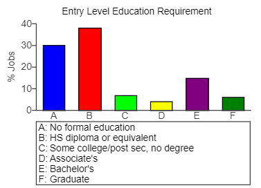
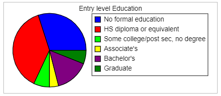
(72.) Data on the percentage of jobs that require various levels of education are displayed in the following bar chart and pie chart.
Education Requirement Bar Chart
Education Requirement Pie Chart
(a.) Approximately what percentage of jobs require some type of college degree (Associate's, Bachelor's, or Graduate)?
(b.) Use the graphs to estimate the difference between the percentage of jobs that require a high school diploma and those that require no formal education.
(c.) Is this easier to estimate using the bar chart or the pie chart?
(a.) Using the bar graph:
The percentage of jobs that require Associate's degree (D) is about 2.5%
The percentage of jobs that require Bachelor's degree (E) is about 18%
The percentage of jobs that require Graduate degree (F) is about 4.5%
∴ the percentage of jobs require some type of college degree (Associate's, Bachelor's, or Graduate) is about 2.5% + 18% + 4.5% = 25%
(b.) Using the bar graph:
The percentage of jobs that require a high school diploma (B) is about 38%
The percentage of jobs that require no formal education (A) is about 30%
Difference = 38% - 30% = 8%
(c.) It is easier to use a bar chart because you can compare values using the heights of the bars, whereas it can be hard to determine which of two slices in a pie chart is larger when they are close in size and not adjacent to each other.
(73.)
(74.) A categorical variable is only called bimodal under what circumstances?
A. The data consists of exactly two categories. B. Two categories are nearly tied for most frequent outcomes. C. Two categories have exactly the same frequency. D. One category occurs more frequently than any other.
B. Two categories are nearly tied for most frequent outcomes.
(75.)
(76.) In 2017 the Pew Research Center polled 3930 adults in the United States and found that 43% reported playing video games often on some kind of electronic device. I. Identify the population II. Identify the sample. III. What is the parameter of interest? IV. What is the statistic?
I. The population is adults in the United States. II. The sample is the 3930 adults surveyed. III. The parameter is the percentage of all adults who play video games. IV. The statistic is the 43% of the sample who play video games.
(77.)
(78.) For the following scenarios, identify and write the symbols, as applicable the:
(a.) population mean
(b.) sample mean
(c.) population standard deviation
(d.) sample standard deviation
(I.) In determining the mean age of all students at your school, you survey 30 students and find the mean of their ages.
(II.) To estimate the commute time for all students at a college, 200 students are asked to report their commute times in minutes.
The standard deviation for these 200 commute times was 19.8 minutes.
(III.) The mean GPA of all 3000 students at a college is 2.69.
A sample of 150 GPAs from this school has a mean of 2.43.
(IV.) The standard deviation of all professional NBA basketball players is 28.9 pounds.
A sample of 40 professional basketball players has a standard deviation of 22.5 pounds.
(I.) The mean, a statistic is the sample mean, $\bar{x}$
(II.) The standard deviation, a statistic, s = 19.8 minutes
(III.) The population mean, μ = 2.69, and the sample mean, $\bar{x}$ = 2.43
(IV.) The population standard deviation, σ = 28.9 pounds and the sample standard deviation, s = 22.5 pounds.
(79.)
(80.) Assume your class has 30 students and you want a random sample of 10 of them. Describe how to randomly select 10 people from your class using the random number table.
A. Assign each student a pair of digits 00 – 29.
Read off pairs of digits from the random number table from left to right.
The students whose digits are called are in the sample.
Skip repeats.
Stop after 10 students are selected.
B. Assign each student a number 0 – 29.
Read off numbers from the random number table from left to right.
The students whose digits are called are in the sample.
Skip repeats.
Stop after 10 students are selected.
C. Assign each student a pair of digits 00 – 29 based on the day of the month in which he or she was born.
Read off pairs of digits from the random number table from left to right.
The students whose digits are called are in the sample.
Skip repeats.
Stop after 10 students are selected.
D. Assign each student a number 0 – 29 based on the day of the month in which he or she was born.
Read off numbers from the random number table from left to right.
The students whose digits are called are in the sample.
Skip repeats.
Stop after 10 students are selected.
A. Assign each student a pair of digits 00 – 29.
Read off pairs of digits from the random number table from left to right.
The students whose digits are called are in the sample.
Skip repeats.
Stop after 10 students are selected.
(82.) Suppose that, when taking a random sample of three students' GPAs, you get a sample mean of 3.90. This sample mean is far higher than the college-wide (population) mean.
Does this prove that your sample is biased? Explain.
What else could have caused this high mean?
A. One or more of the students could have lied about their GPAs.
B. The sample may not be biased.
The high mean might have occurred by chance, since the sample size is very small.
C. The sample may not be biased.
The measurements may not have been precise.
D. Nothing other than bias could have caused this small mean.
B. The sample may not be biased.
The high mean might have occurred by chance, since the sample size is very small.
Since the students were chosen at random, it is likely that by chance the random selection only picked students with high GPAs.
(83.) Use StatCrunch to generate and write down each list of numbers.
Select Data, highlight Simulate, then select Uniform.
A dialog box similar to the one shown here... will appear.
(a.) Generate ten random numbers between 0 and 1 using the fixed seed value 18081.
(b.) Generate ten random numbers between 0 and 10 using the fixed seed value 15055.
(c.) Generate ten random numbers between 1 and 2 using the fixed seed value 17699.
(d.) Generate ten random numbers between 10 and 20 using the fixed seed value 13024.
(Type integers or decimals rounded to three decimal places as needed.)
Set Up:
1st Step:
2nd Step:
3rd Step:
4th Step:
(a.)
(b.)
(c.)
(d.)
(84.) Use StatCrunch to generate and write down each list of numbers.
Select Data, highlight Simulate, then select Uniform.
A dialog box similar to the one shown here... will appear.
Please review Number (83.) prior to attempting this question.
(a.) Generate ten random numbers between 0 and 1 using the fixed seed value 12450.
(b.) What is the mean of the numbers (to find this, divide the sum of the numbers by 10)?
(c.) Generate ten random numbers between 0 and 1 using the fixed seed value 11823.
(d.) What is the mean of the numbers (to find this, divide the sum of the numbers by 10)?
(e.) Generate ten random numbers between 0 and 1 using the fixed seed value 12522.
(f.) What is the mean of the numbers (to find this, divide the sum of the numbers by 10)?
(g.) Generate ten random numbers between 0 and 1 using the fixed seed value 11927.
(h.) What is the mean of the numbers (to find this, divide the sum of the numbers by 10)?
(Type integers or decimals rounded to three decimal places as needed.)
(i.) How do the four means (including the one for the first set) compare?
(j.) Without carrying out the calculation, what number do you think the average of 1000 random numbers between 0 and 1 is near? Explain.
(a.) and (b.)
(c.) and (d.)
(e.) and (f.)
(g.) and (h.)
(i.) The means are close to 0.5
(j.) The mean will be near 0.5, because the means of samples from a distribution tend toward the mean of the distribution.
(85.)
(86.)
(87.)
(88.) Suppose you attend a school that offers both traditional courses and online courses.
You want to know the average age of all the students.
You walk around campus asking those students that you meet how old they are.
Would this result in an unbiased sample?
A. No, since students themselves choose to participate in the survey, resulting in response bias.
B. No, since a relatively large number of students may refuse to respond or lie when asked about their age.
C. No, since this method will not select people who take online classes but may have a different mean age than the traditional students.
D. Yes, since this sample is random and samples from the entire population.
C. No, since this method will not select people who take online classes but may have a different mean age than the traditional students.
(89.)
(90.)
(91.) The table gives information on majors at a certain college.
Sketch an appropriate graph of the distribution, and comment on its important features.
Majors
Major
Percentage
H. Humanities
20
SS. Social Science
19
MS. Math and Science
36
I. Interdisciplinary
25
(a.) One type of graph appropriate for showing this distribution is a bar chart.
Which of the following bar charts correctly shows the given distribution?
(b.) What other appropriate graphs cana be used for showing the given distribution?
(c.) Which of the following is the best description of the distribution's important features?
(a.) MS. Math and Science has the highest percentage.
So, Options B and D are eliminated, leaving us with Options A and C
SS. Social Science has the lowest percentage.
Options A and C meet that criteria as well.
On a closer and careful observation of both graphs, we notice that in Option A, the H is 20 and the SS is 19 (correct)
while in Option C, the H is 19 and the SS is 20 (incorrect)
This shows that the bar chart that correctly shows the given distribution is: Option A.
(b.) Other appropriate graphs that can be used for showing the given distribution are:
Pareto charts and Pie charts because they are suited for presenting categorical variables.
(c.) The mode is Math and Science (MS).
(92.) If a rifleman's gunsight is adjusted correctly but he has shaky arms, he might shoot bullets scattered widely around the bull's-eye target.
(a.) Draw a sketch of the target with the bullet holes.
(b.) Does this show variation (lack of precision) or bias?
(c.) Draw a second sketch of the target if the shots are both unbiased and precise (have little variation).
The rifleman's aim is not perfect, so your sketches should show more than one bullet hole.
(a.) The sketch of the target with the bullet holes scattered widely around the bull's-eye target is:
(b.) This shows a lack of precision.
Since the bullets are not clustered close together, the shots are not precise.
The results are not biased since the bullets missed in different directions.
(c.) The sketch that shows that the shots are both unbiased and precise is:
 For ACT Students